Posted
on July 18, 2025, 8:44 PM,
by jfriedman,
under art history.
“Wayne Thiebaud: Art Comes from Art,” which opened at the California Palace of the Legion of Honor in San Francisco on March 22, is organized by the Fine Arts Museums of San Francisco and curated by Timothy Anglin Burgard. Its premise, spelled out in the title, is straight forward enough and firmly based on the artist’s own ideas about painting. Wayne Thiebaud (1920–2021) spoke about his debt to other painters on numerous occasions, half-jokingly calling himself an “obsessive thief.” Those who studied and wrote about his work, as well as his students of many decades, are already well aware of Thiebaud’s inextricable connection to art history. Unfortunately, that is not yet true of the public, delighted as they are by his familiar subject matter and the bright palette of his paintings and prints.
While admiring his luscious renditions of deli or haberdashery counters, typical museumgoers (and even some art critics) are still largely content to see his work as a West Coast variety of American Pop Art—a more painterly version of the East Coast’s obsession with hand-rendered imitations of mechanical reproduction (Warhol and Lichtenstein) or commercial cornucopia (Rosenquist and Oldenburg). Despite the painter’s vociferous objections to being called a Pop artist, there are plenty of Thiebaud lovers who pine for comprehensive exhibitions of his “greatest hits” accompanied by reassuring platitudes about the uniqueness of California Pop.
The Legion of Honor exhibition disabuses any attentive visitor of the idea that Thiebaud, although he spent most of his life in California, was a regional painter, a Pop artist, or a popularizer of Americana disconnected from the art of other places and other times. Its portrayal of Thiebaud is familiar to those who had the privilege of knowing him: a worldly, curious intellectual, an art connoisseur, a man of supple mind and a lively sense of humor, and, above all, a “practicing art historian” (his own description of Picasso), whose painting was nearly always a response to the art that captivated him. Thiebaud’s stated goal was to create painting of a “different visual species”—different from the real world and from all other painting, yet informed by both, as well as by the individual world of the painter. “Art Comes from Art” takes the viewer behind the scenes, into Thiebaud’s studio, his classroom, and even his home (where most of his art collection was kept), showing how, according to Tim Burgard, the painter’s “overt homage, covert theft, and intuitive transformation” led to the creation of what Thiebaud himself called his unique and “different visual species.”
To read the entire article, click on the image above.
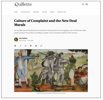
My recent Quillette article about Thomas J Price’s unfortunate installations in Times Square. Once again ideologically charged art produces unintended results. I explain how Price’s bronze giantess and his Orwellian “Man Series” billboards echo some cringeworthy art history.
A sad reminder of that newer does not mean better, as illustrated by the Getty Center exhibition “Gustave Caillebotte: Painting Men.”
The organizers of “Painting Men” which aims to address the shortcomings of Caillebotte scholarship’s “blinkered view” concerning his purported “male bias” and alleged “questioning of masculine identity that seems freshly relevant today” were not deterred by the lack of primary documents that might have revealed “what Caillebotte really thought about these issues.” Nor were they impressed by his contemporaries’ obliviousness to “male bias” when “they were quick to label other Impressionists . . . as ‘painters of women.’ ’’
The focal painting in the current show, the 1884 Man at His Bath, which the organizers deem Caillebotte’s “most transgressive work” because it “inverts” “normative gendered looking” and thus “clearly represents a problem for both the history of art and the history of sexuality,” went unnoticed when it was initially shown to the public in 1888. This does not prevent the Getty show from insisting on “the libidinal dynamics and the invitation to homoerotic viewing unleashed by the painting itself.”
What can we take away from such analysis? According to André Dombrowski and Jonathan D. Katz, who cowrote the catalogue’s final article, the real impact of Caillebotte’s work is this: in place of the usual kinds of queer readings that presume a figure’s deliberate hiding or self-effacement, accompanied perhaps, by the kind of unselfconscious psychic leakage that is pure gold to the academic, we have sought to proffer a different Caillebotte, one who self-consciously created something once unassimilable, although increasingly coming into clarity as we finally begin to abandon the rigidly binary opposition of homosexuality and heterosexuality in favor of a more nuanced and sensitive account of desire.
This vocabulary and critical apparatus are now old hat. It is almost forty years since Hilton Kramer, the founder of this publication, complained about “the dismal fate of art history when the study of art is no longer its primary concern.” Interpretation based on postmodern identity politics only makes sense when the painter’s focus is on the self rather than on aesthetics. Yet Dombrowski and Katz see art as “an irritant [that] transposes the irritation it engenders from the painting, a mere external object, into the self.” Unfortunately for “mere external objects,” this profoundly narcissistic tendency to see a work of art as a prompt or a prop for self-examination is still popular in some quarters.
My essay “From Sfumato to Ganzfelds” argues that in order to remove the barriers between the art and its audiences, California Light and Space artists relied on the same four optical modes as the Renaissance painters. Sfumato, chiaroscuro, unione, and cangiantismo are all represented in the works of Peter Alexander, De Wain Valentine, James Turrell, Helen Pashgian, Doug Wheeler, Robert Irwin, and Larry Bell.
The catalogue is available for preorder on the Foundation website.
Posted
on October 17, 2024, 12:28 PM,
by jfriedman,
under art history.
My latest article for Quillette is an update of sorts on Robert Hughes’ writings from three decades ago about the “therapeutic fallacy” and the “censorious right.” Now it is the censorious left that is swinging the bat.
Posted
on October 3, 2024, 10:47 AM,
by jfriedman,
under Community Art.
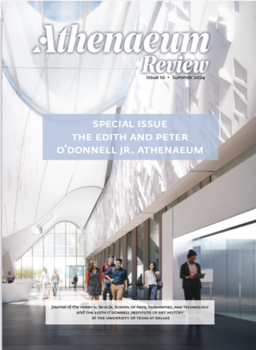
The latest issue of the Dallas-based humanities quarterly is dedicated to the Edith and Peter O’Donnell Jr. Atheneum—the 12-acre UT Dallas campus art district designed by iconic architecture firm Morphosis. I contributed an article “Why we Need the Athenaeum” in which I argue that the Athenaeum model of public spaces is exactly what our culture needs to restore waning real-life social connections.
Site Santa Fe: in conversation with Dave Hickey 04.15.16.
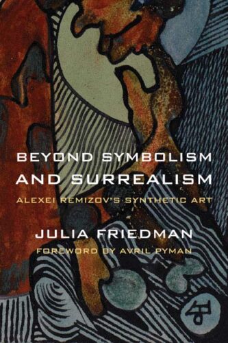
The great modernist eccentric Alexei Remizov was a “writers’ writer” whose innovative poetic prose has long since entered the Russian literary canon. Gradually expanding his working methods to make drawing an integral part of the writing process, during the 1930s and 1940s, Remizov created hundreds of albums that combined texts with collages and india ink and watercolor illustrations. (more)
Northwestern University Press
7 x 10, 300 pgs, Trade Cloth
ISBN 0-8101-2617-6 / $69.95
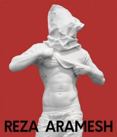
Skira Editore Milano just published a monograph on British-Iranian artist Reza Aramesh. In addition to several texts, and an interview with the artist, ACTION: BY NUMBER contains a catalogue raisonné of his work from 2002 onwards, including Aramesh’s recent marble sculpture. I discuss the art-historical genesis and cultural meaning of these spectacular and frightening works in my essay “The Meta of Marble.” (pp.124–129).
SKIRA Editore Milano
Hardcover. 248 pages, 153 ill., size 24x28cm
ISBN 978-88-572-5285-8
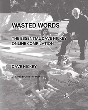
Between June 2014 and April 2015, Dave Hickey posted almost 3,000 digital comments on social media, prompting nearly 700,000 words in response from art lovers, acolytes, and skeptics. Wasted Words is an unedited comprehensive transcript of these exchanges. This polyphonic digital discourse reveals the range of Hickey’s strong opinions, as he embarks on a crypto-enlightenment project for the benefit of "dunces" and "pricks." Paperback, 586 pages, 2016 ISBN-10: 1517287103
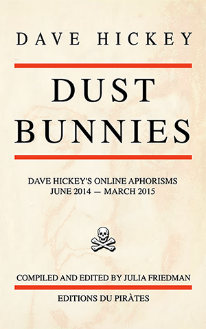
Dustbunnies is an assemblage of “swept up” fragments that came from a vast digital discourse that took place in Dave Hickey’s social media space between June 2014 and March 2015. During that time Hickey posted almost 3,000 comments, prompting nearly 700,000 words in response from art lovers, acolytes and skeptics. Wasted Words, the resulting volume, is an unedited comprehensive transcript of these exchanges. Its pendant publication, Dustbunnies, distills Hickey’s richly aphoristic comments, extracted from various discussion threads. Paperback, 124 pages, 2016 ISBN-10: 152327266X
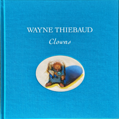
Over the past seven years Wayne Thiebaud has made dozens of paintings, drawings, and etchings of clowns. Like much of his work, this latest series is in a sense autobiographical. During his boyhood in Long Beach he looked forward to the visits of a traveling Ringling Brothers circus and sometimes helped out behind the scenes in exchange for tickets. The costumes, faces, and antics of the clowns were the beginning of a lifelong fascination for him. The clown series is its culmination, in which the now 100-year-old artist revisits those early memories.
In December 2019 Wayne Thiebaud unveiled a selection from his clown series at the San Francisco gallery founded by his son, Paul Thiebaud. The Laguna Art Museum exhibition will be a version of the Paul Thiebaud Gallery exhibition, featuring more than forty works.
Fully illustrated with 56 artwork reproductions. Essay by Dr. Julia Friedman. Interview with the artist by Janet Bishop, the Thomas Weisel Family Chief Curator and Curator of Painting and Sculpture at San Francisco Museum of Modern Art.
Hardcover: 100 pages; ISBN-10: 0578798573ISBN-13: 978-0578798578
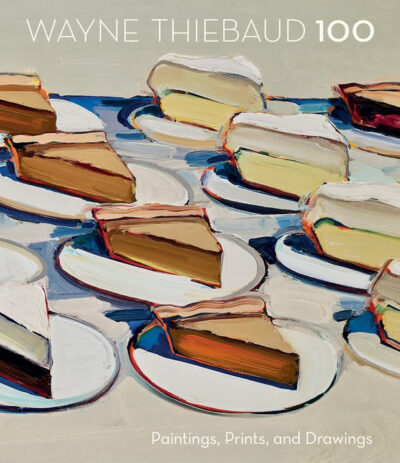
Celebrating the 100th birthday of one of America's most respected and beloved artists, Wayne Thiebaud 100: Paintings, Prints, and Drawings honors a lifetime of extraordinary achievements across many genres. Best known for his tantalizing paintings of desserts, Thiebaud has long been affiliated with Pop Art, though his body of work is far more expansive, continuing to grow as the artist approaches his milestone birthday. Across the decades, Thiebaud has explored various details of American life through his art from urban views and rural landscapes to clowns and household items all the time continuing to explore the food subjects that made him famous.
Wayne Thiebaud 100 accompanies an exhibition of the same name, organized by the Crocker Art Museum. In addition to the 100 paintings, prints, and drawings featured in the exhibition, this publication includes numerous other contextual paintings by Thiebaud, art by the masters who inspired him, and photographs of the artist with family and friends, taken over the course of his extraordinary career.
Hardcover : 212 pages
ISBN-10 : 1087501172
Dimensions : 9.8 x 0.9 x 11.3 inches
ISBN-13 : 978-1087501178
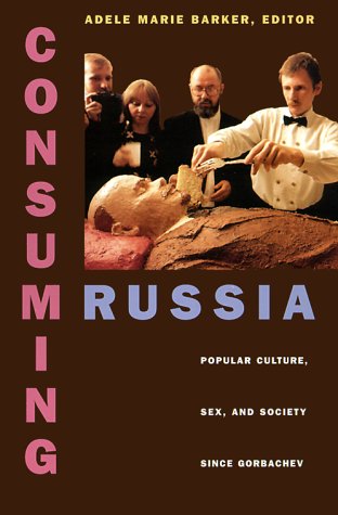
Consuming Russia: Popular Culture, Sex, and Society since Gorbachev
Adele Marie Barker (Editor), Eliot Borenstein (Contributor), Julia Friedman (Contributor), Adam Weiner (Contributor), Elizabeth Kristofovich Zelensky (Contributor), Robert Edelman (Contributor)
With the collapse of the Soviet empire in the late 1980s, the Russian social landscape has undergone its most dramatic changes since the Bolshevik Revolution in 1917, turning the once bland and monolithic state-run marketplace into a virtual maze of specialty shops—from sushi bars to discotheques and tattoo parlors... (more)
Paperback: 488 pages
Publisher: Duke University Press Books (June 10, 1999)
Language: English
ISBN-10: 0822323133
ISBN-13: 978-0822323136
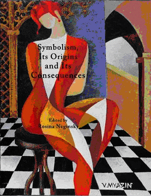
“A Powerless Seeker: Merezhkovsky’s Romance as Life-Writing” by Julia Friedman
In Symbolism, its Origins and Consequences. Edited by Rosina Neginsky. Cambridge: Cambridge Scholars, 2010
Hardcover: 665 pages
Publisher: Cambridge Scholars Publishing
New edition edition (October 1, 2010)
Language: English
ISBN-10: 1443823929
ISBN-13: 978-1443823920
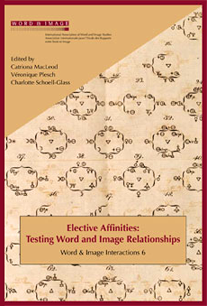
“The Writing-Drawing Continuum of Alexei Remizov,” by Julia Friedman
"Elective affinities" - a notion originally borrowed by Goethe for his 1809 novel of the same title from eighteenth-century chemistry - here refers to the active role of the two partners in the relationship of the pictorial and the verbal...
In In Elective Affinities: Word & Image Interactions 6, 2008
Edited by Catriona McLeod, Véronique Plesch and Charlotte Schoell-Glass.
Amsterdam and Atlanta: Rodopi
Paperback: 422 pages
Publisher: Rodopi (June 20, 2009)
Language: English
ISBN-10: 9042026189
ISBN-13: 978-9042026186
“Alexei Remizov’s Creative Act,” by Julia Friedman. Edited by Maurice Geracht and Frédéric Ogée.
In Interfaces: Image Text Language, vol. 29, 2010
In this response to artist Josh Kline’s essay on the state of American art, I take a closer look at the idea that the art world has recently fallen into crisis. Kline argues that today’s system is no longer able to support artists in meaningful ways. I question that view by looking at the history […]
In 2026, the viral photograph of the former prince briefly entered the Louvre, but only to intensify its existing meaning by borrowing the institution’s authority. That shift tells us less about the guilt of the individuals involved than it does about the evolution of spectacle itself. Above all, it suggests an ominous, growing impatience with […]
In this essay, I look beyond the familiar arguments for preservation or removal to ask what these objects actually do in civic life. Monuments compress history into visible form, but they also expose the tensions between reverence and critique. At a moment when public memory is deeply contested, monuments become mirrors, reflecting contemporary values as […]
Rejecting sentimental or anecdotal portraiture, Thiebaud cultivates a suspended psychological charge, inviting viewers into the role of Wollheim’s “unrepresented spectator.” His sitters—poised before or after action—occupy pared-down spaces where gesture is displaced by the quiet gravity of presence. Through this deliberate withholding, Thiebaud reanimates classical problems of painting, aligning himself with Velázquez and Manet while […]
The notorious 19th-century anarchist Mikhail Bakunin, who proclaimed that “the urge for destruction is also a creative urge,” has found an unlikely disciple in Trump. Considered together, the 1980 and 2025 episodes teach the lesson that destruction can be a form of authorship. Once the reliefs were gone, their loss defined both the building and […]
Walter Benjamin called the twentieth century “the age of mechanical reproduction,” but his contemporaries were still capable of distinguishing between a celebrity’s real personality and her image. The twenty-first century is the age of digital reproduction, and it forces us to ask whether the general public still possesses the capacity to recognize such a distinction. […]
Perhaps this is why Alpers is befuddled by today’s disciplinary confusion in which art, the master, is subjugated by art history, supposedly its emissary. Consider the following remark she made in a 2022 follow-up to the earlier conversation with Ziegler: “I agree with my great, late art historian friend Michael Podro, who said that painting […]